Fun Infographic Highlights Big Differences in When Europeans Eat Dinner
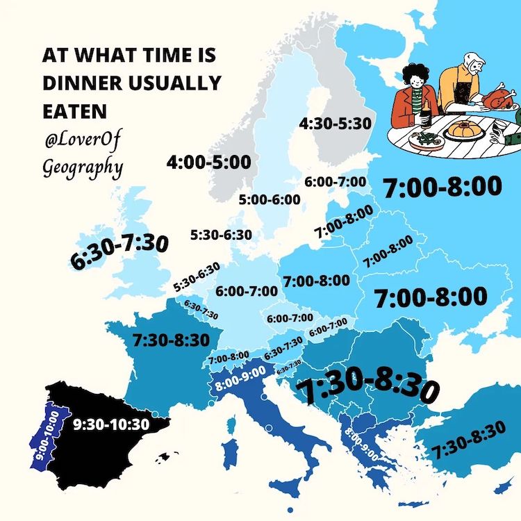
What time is dinner? This seemingly simple question has quite a different answer depending on where you are in the world. Thanks to Orkun Melih Köksal, who runs the Instagram account @loverofgeography, it's easy to see just how different dining habits are across Europe. The Dutch map lover is just 20 years old, but he's been running his account for several years and gained quite a following.
“As a little kid as young as five years old, I always had a little bit of passion for world maps or countries,” he tells My Modern Met. “I had a huge world map in my room. Every day when I came back home from school, I kept staring at the world map in my room because of how fascinating it was to me while most other kids just wouldn't care. I was playing games with myself trying to find all the countries and cities on the map. Years later when I was about 17, I saw all these mappers on Instagram and thought I can do that too but better with my own map style and not just stolen maps from Reddit. I wanted to entertain people and educate them at the same time by making maps more fun.”
He's certainly delivered on his promise. With over 63,000 followers, Köksal stays true to his “Lover of Geography” handle and delivers fun and informative content. And, he's careful to note, every map comes with a thoughtful amount of research. For instance, to create his dinnertime infographic, he looked at multiple sources.
First, he turned to Google and searched dinner times of each individual country. He then turned to his followers and asked 20 people from each country the time that they eat supper. After comparing the answers he received with those from Google, he got his average time.
All of his work naturally starts with his own curiosity. For instance, the dinner infographic originated when he noticed that Spanish exchange students would marvel at how early Dutch people eat dinner. While, at the same time, he knew that Dutch expats in Spain felt it was strange to eat so late. This bit of personal knowledge then spun into a wonderful design that sparked a lot of conversation from his followers.
This is just one of many fascinating facts he brings to light through his informative maps. Geography and culture lovers will also appreciate how often he posts so that there is always something new to learn.
Lover of Geography is a fun Instagram account run by map lover Orkun Melih Köksal.
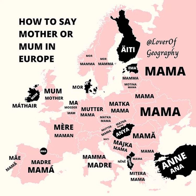
The 20-year-old has been fascinated by geography since childhood and started making infographics several years ago.
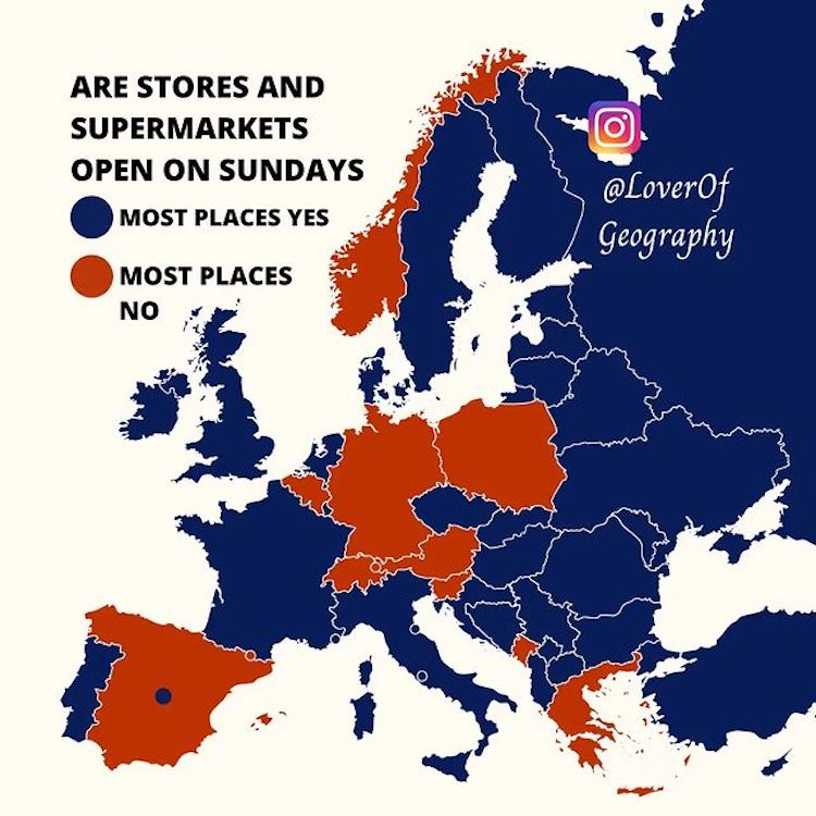
Each informative map is the result of careful research.
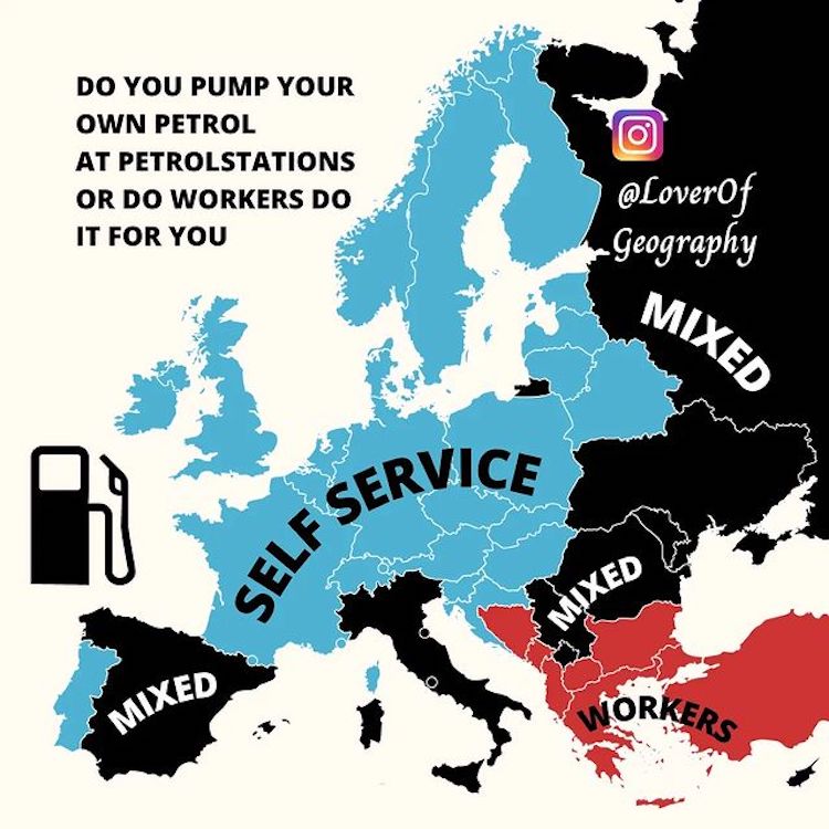
He mainly focuses on Europe, but occasionally covers the entire globe.
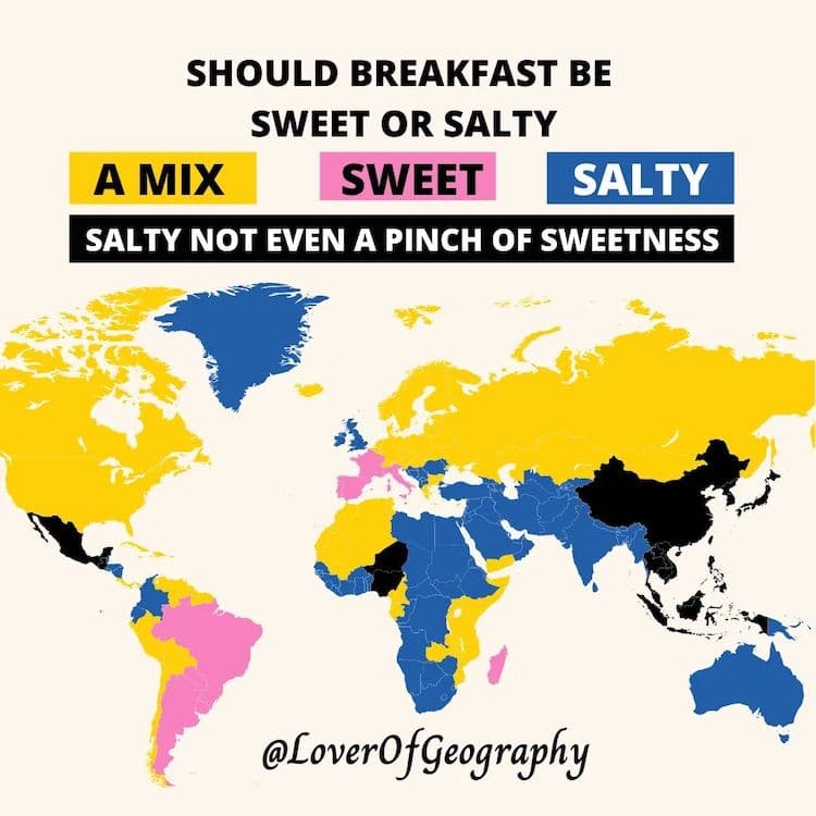 Lover of Geography: Instagram
My Modern Met granted permission to feature photos by Lover of Geography.
Related Articles:
100 Common Myths Debunked in One Comprehensive Infographic
These Brilliant Etymology Infographics Reveal the Origins of Common Words
Eye-Opening Infographic Reveals the Real Value of $100 in Each of State in the US
Illustrated Infographic Shows 63 Differences Between American and British English
READ: Fun Infographic Highlights Big Differences in When Europeans Eat Dinner


0 Commentaires